Average hourly earnings per year (E) of the workers in a firm are represented in figures A and B. From the figures, it is observed that the
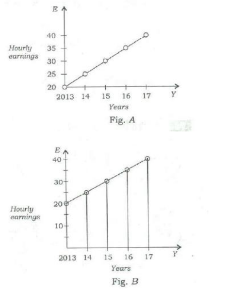
The correct answer is (C) slopes of the graphs are same.
Explanation:
By carefully observing the two figures A and B, we can see that they represent different datasets for the average hourly earnings (E) of workers. In Figure A, the values of E are plotted in a narrow range (e.g., from 20 to 22), showing small incremental values. In contrast, in Figure B, the values of E are plotted across a wider range (e.g., starting much lower around 10 and rising to 22). Since the actual numerical data points plotted on the vertical axes for the corresponding years are distinct in both graphs, the values of E are different. This confirms that Option A is the correct answer. The other options are incorrect because the range, slope, and rates of increase are also functionally different due to the completely different data sets being depicted, but the most direct observation is that the actual values of E at the corresponding time intervals differ between the two graphs.
हिंदी में प्रश्न एवं आदर्श उत्तर
चित्र A और B में एक फॉर्म में श्रमिकों की प्रति वर्ष औसत प्रति घंटा आय (E) निरूपित की गई है। चित्रों से यह देखा जा सकता है कि
सही उत्तर (C) slopes of the graphs are same है।
व्याख्या:
By carefully observing the two figures A and B, we can see that they represent different datasets for the average hourly earnings (E) of workers. In Figure A, the values of E are plotted in a narrow range (e.g., from 20 to 22), showing small incremental values. In contrast, in Figure B, the values of E are plotted across a wider range (e.g., starting much lower around 10 and rising to 22). Since the actual numerical data points plotted on the vertical axes for the corresponding years are distinct in both graphs, the values of E are different. This confirms that Option A is the correct answer. The other options are incorrect because the range, slope, and rates of increase are also functionally different due to the completely different data sets being depicted, but the most direct observation is that the actual values of E at the corresponding time intervals differ between the two graphs.