Home›UPSC Prelims›Paper 2: General Studies II (CSAT)›Civil Services Aptitude Test (CSAT)›Basic Numeracy & Data Interpretation›The graph below depicts the earnings of A and B over the period 2000

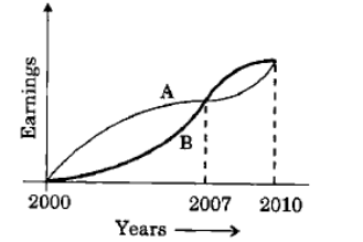
The graph below depicts the earnings of A and B over the period 2000 to 2010:

From the graph, which one of the following can be concluded?
Question diagram
20152Mprelimsupscyear-2015p2csatquantitative-abilitydata-interpretation
A.On the average A earned more than B during this periodCorrect
B.On the average B earned more than A during this period.
C.The earnings of A and B were equal during this period.
D.The earnings of A were less as compared to B during this period.
Explanation & Solution

Correct Option: (A) On the average A earned more than B during this period

हिंदी में प्रश्न एवं आदर्श उत्तर

The graph below depicts the earnings of A and B over the period 2000 to 2010:

From the graph, which one of the following can be concluded?

प्रश्न का चित्र
A.On the average A earned more than B during this periodसही
B.On the average B earned more than A during this period.
C.The earnings of A and B were equal during this period.
D.The earnings of A were less as compared to B during this period.

सही उत्तर: (A) On the average A earned more than B during this period

See this question in context →
Free Android App

Practice Better on the StatePYQ Mobile App

⚡ Error Diary · ⏱ Timed Mains Answer Pacer · 📴 Offline Revision Vault

Get it onGoogle Play